10 Essential WordPress Security Tips for 2026
WordPress security continues to be a top priority in 2026.As cyberattacks become more advanced with the rise of...

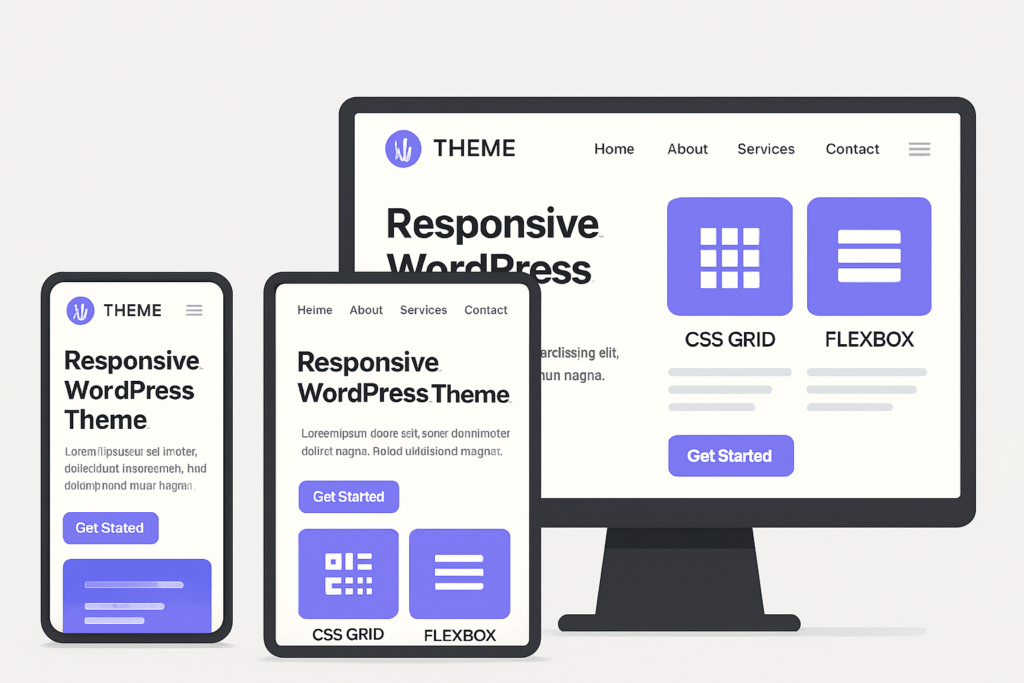
Creating responsive WordPress themes is essential in today’s mobile-first world.
With users accessing websites from a wide variety of devices, ensuring your theme adapts beautifully to any screen size is no longer optional — it’s a must.
This guide covers the best practices for building responsive, high-performing, and user-friendly WordPress themes that look great everywhere.
Start your design process with mobile devices in mind.
Designing from small screens upward helps ensure that your theme loads fast, displays correctly, and delivers a smooth experience on phones and tablets.
Once the mobile layout is solid, you can progressively enhance it for tablets and desktops using media queries.
Key Tips:
Modern CSS layout systems like Grid and Flexbox make building responsive layouts easier and more efficient than ever.
Flexbox is perfect for aligning elements in a row or column, while CSS Grid excels at complex, two-dimensional layouts.
Best Practices:
minmax() and auto-fit to make grids truly responsive.These modern layout methods replace outdated float-based designs and ensure consistency across all viewports.
Images can make or break performance on mobile devices.
Use WordPress’s built-in responsive image features, including the srcset and sizes attributes, to serve the right image size based on the device.
Tips for Responsive Images:
This approach ensures your theme loads fast without compromising visual quality.
Navigation should be effortless on all devices — especially touchscreens.
Make sure your menus and buttons are finger-friendly:
You can also use off-canvas menus or hamburger icons for small screens to save space without losing usability.
A responsive theme should also be lightweight and optimized for performance.
Follow these best practices:
Fast-loading themes not only improve user experience but also enhance SEO rankings.
No matter how well you code, testing is crucial to ensure a consistent experience across browsers and devices.
Testing Checklist:
Testing helps you catch visual or functional issues early — before your users do.
Building a responsive WordPress theme is about more than just fitting the screen — it’s about delivering a seamless experience to every user, everywhere.
By following these best practices, you’ll create themes that are fast, flexible, and future-ready.
At XpertiseCoder, we specialize in:
Want a theme that looks great on every device — and converts better too?
👉 Contact us today for a free consultation and let’s build a stunning, responsive WordPress theme for your brand.
Let's discuss how we can help bring your ideas to life with our expert development services.